matplotlib绘制模型对比折线图
Published:
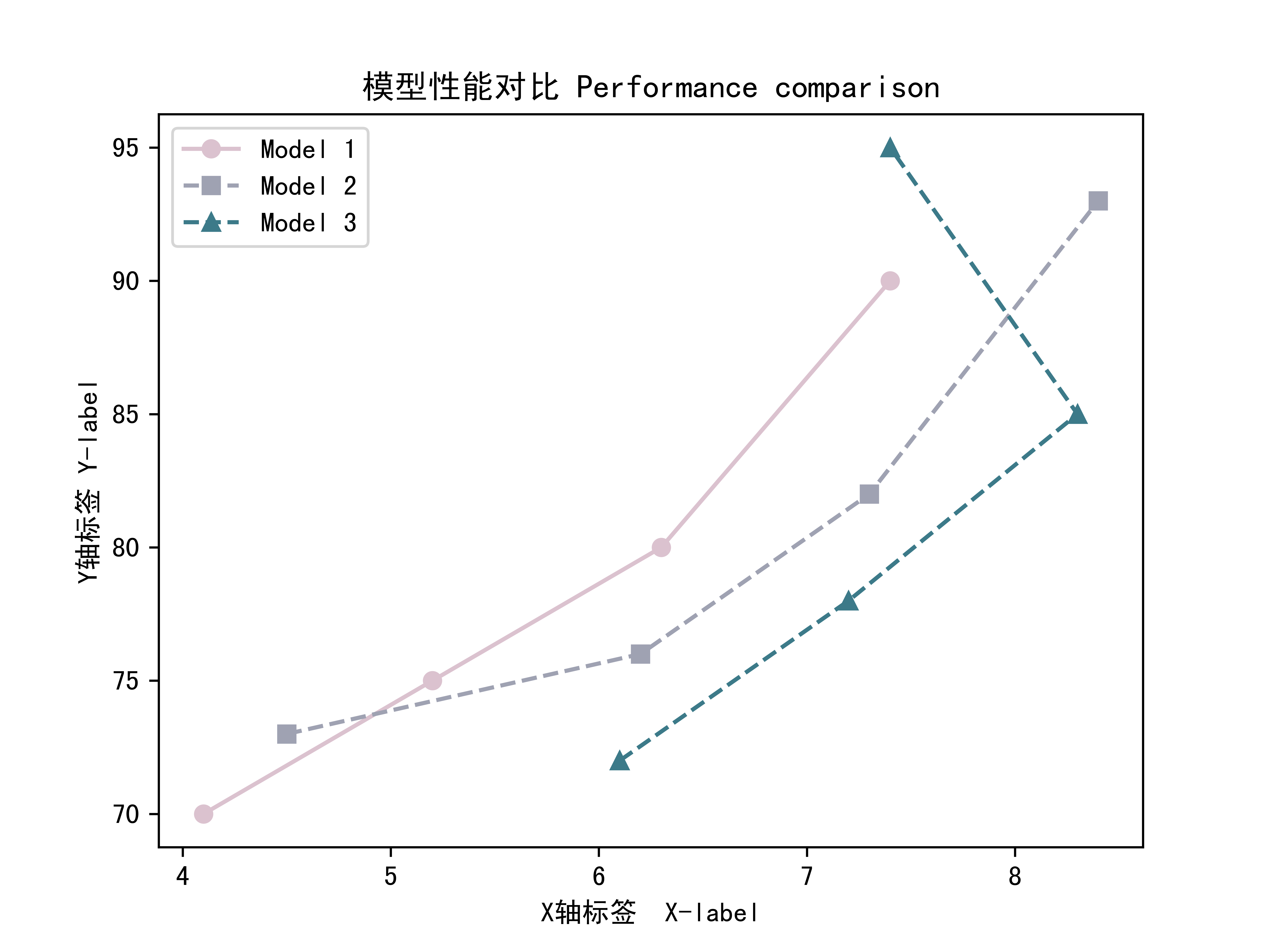
直接看代码和结果一目了然:
Code
''' chatgpt : draw figures using matplotlib '''
'''Pyplot tutorial: https://www.matplotlib.org.cn/tutorials/introductory/pyplot.html#working-with-multiple-figures-and-axes'''

import matplotlib.pyplot as plt


def plot_model_comparison(data_x, data_y, model_labels, colors, markers, linestyles, x_label, y_label, title):
    """
    绘制模型性能对比的折线图, x,y对应两种性能指标, 颜色对应'同类模型结构'的不同设置

    参数:
    - data_x: 二维数组,每行代表一个模型的性能数据
    - data_y: 二维数组,每行代表一个模型的性能数据
        data_x,data_y 每个元素对应的模型要相同
    - model_labels: 模型标签列表
    - colors : Hex 编码
    - markers :
                'o': 圆圈      '1': 下指针
                'v': 倒三角形  '2': 上指针
                '^': 正三角形  '3': 左指针
                '<': 左三角形  '4': 右指针
                '>': 右三角形  '+': 加号
                's': 正方形    'x': 叉号
                'p': 五角形    'D': 菱形
                '*': 星形      'd': 瘦菱形
                'h': 六边形1
                'H': 六边形2
    - linestyle :
                '-':实线
                '--':虚线
                '-.':点划线
                ':':点线
    - x_label: x 轴标签
    - y_label: y 轴标签
    - title: 图表标题
    """
    plt.rcParams['font.sans-serif'] = ['SimHei']
    plt.rcParams['axes.unicode_minus'] = False

    for i in range(len(data_y)):
        plt.plot(data_x[i], data_y[i], color=colors[i], marker=markers[i], linestyle=linestyles[i], label=model_labels[i])

    plt.xlabel(x_label)
    plt.ylabel(y_label)
    plt.title(title)
    plt.legend()
    plt.show()


    plt.savefig('fig.png', dpi=1200)
    print('fig is saved!')

# 示例用法
if __name__ == '__main__':

    data_x = [
        [4.1, 5.2, 6.3, 7.4],  # 例如:每行代表同类model在不同设置下的 params
        [4.5, 6.2, 7.3, 8.4],
        [6.1, 7.2, 8.3, 7.4],

    ]

    data_y = [
        [70., 75., 80., 90.],  # 例如:每行代表同类模型在不同设置下的 test_acc
        [73., 76., 82., 93.],
        [72., 78., 85., 95.],
    ]

    model_labels = ['Model 1', 'Model 2', 'Model 3'] # 模型名称 , 要跟data_x, data_y每一行对应
    colors = ['#DBC2CF', '#9FA2B2', '#3C7A89']  # 在 https://coolors.co/ 找喜欢的配色
    markers = ['o', 's', '^']  # 符号类型,每个模型对应一个符号
    linestyle = ['-', '--', '--'] # '-':实线(Ours), '--':虚线(others)

    x_label = 'X轴标签  X-label'   # 可以是 params
    y_label = 'Y轴标签 Y-label'    # 可以是 test_acc
    title = '模型性能对比 Performance comparison'

    plot_model_comparison(data_x, data_y, model_labels, colors, markers,linestyle, x_label, y_label, title)


    # 中文字符 https://blog.csdn.net/fwj_ntu/article/details/105598145
    # 下载 SimHei.ttf 放在 类似以下目录中 '/home/user/miniconda3/envs/xx_envs/lib/python3.9/site-packages/matplotlib/mpl-data/fonts/ttf/SimHei.ttf'
    # 修改 '/home/user/miniconda3/envs/xx_envs/lib/python3.9/site-packages/matplotlib/mpl-data/matplotlibrc 文件
    #    #font.family:  sans-serif     -->  取消注释
    #    font.sans-serif: SimHei, ...  -->  在这一行加入SimHei
    # 删除缓存文件 /home/user/.cache/matplotlib/fontlist-xx.json
    # 再次运行 检测是否成功
Output: